Client: StarbucksAgency: POP
Email designIllustration
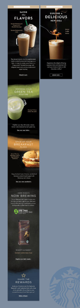
The challenge with the spring email newsletter was to vitalize the interest of customers by introducing them to new, sophisticated flavors on Starbuck’s seasonal menu. I paired custom background textures with a simple one column layout to create intrigue in an easy to parse format.
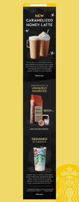
The challenge with the winter email newsletter was to vitalize the interest of customers by introducing them to new, sophisticated flavors on Starbuck’s seasonal menu. This email newsletter had two hero versions depending on location in the US. I used soft watercolour textures to create interest and convey a feeling of simple elegance.